


Bootstrapでのテーブル作成する際のメモを忘備録としてポストします。
Bootstrapで表・Tableを作る方法
デモ
Bootstrapでテーブルを使うデモ はこちらから
![]()
![]()

Bootstrapでテーブルを使ってみるテスト
このページはブログ『Wataame Frog』の「Bootstrap使い方 テーブル編」という記事のサンプルです
lightning-bolt.xyz
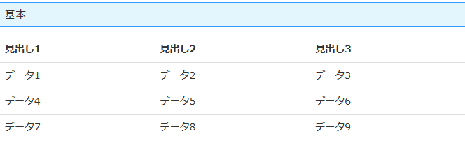
1. 基本
class を “table” とすれば Bootstrap 仕様となる。
thead、tbodyタグは省略できないらしい。
|
1 2 3 4 5 6 7 8 9 10 11 12 13 14 15 16 17 18 19 20 |
<table class="table"> <thead> <tr> <th>見出し1</th> <th>見出し2</th> <th>見出し3</th> </thead> <tbody> <tr> <td>データ1</td> <td>データ2</td> <td>データ3</td> </tr> <tr> <td>データ4</td> <td>データ5</td> <td>データ6</td> </tr> </tbody> </table> |
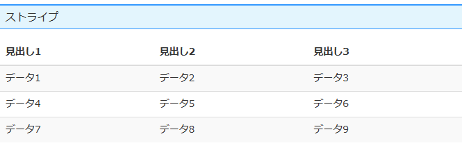
2. ストライプ
“table-striped” クラスで薄いグレーでストライプになる。
色がつくのは、tbody タグの一番最初から、とのこと。
|
1 2 3 4 5 6 7 8 9 10 11 12 13 14 15 16 17 18 19 20 |
<table class="table table-striped"> <thead> <tr> <th>見出し1</th> <th>見出し2</th> <th>見出し3</th> </thead> <tbody> <tr> <td>データ1</td> <td>データ2</td> <td>データ3</td> </tr> <tr> <td>データ4</td> <td>データ5</td> <td>データ6</td> </tr> </tbody> </table> |
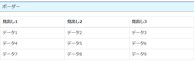
3. ボーダー(縦線)を付ける
“table-bordered” クラスで薄いグレーの縦ボーダーが入る。
|
1 2 3 4 5 6 7 8 9 10 11 12 13 14 15 16 17 18 19 20 |
<table class="table table-bordered"> <thead> <tr> <th>見出し1</th> <th>見出し2</th> <th>見出し3</th> </thead> <tbody> <tr> <td>データ1</td> <td>データ2</td> <td>データ3</td> </tr> <tr> <td>データ4</td> <td>データ5</td> <td>データ6</td> </tr> </tbody> </table> |
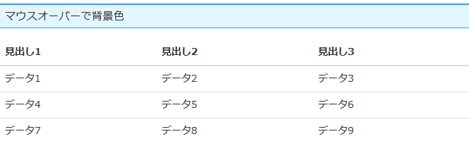
4. マウスオーバーで背景色
“table-hover” クラスで、マウスオーバーした時にセルに背景色が付く。
|
1 2 3 4 5 6 7 8 9 10 11 12 13 14 15 16 17 18 19 20 |
<table class="table table-hover"> <thead> <tr> <th>見出し1</th> <th>見出し2</th> <th>見出し3</th> </thead> <tbody> <tr> <td>データ1</td> <td>データ2</td> <td>データ3</td> </tr> <tr> <td>データ4</td> <td>データ5</td> <td>データ6</td> </tr> </tbody> </table> |
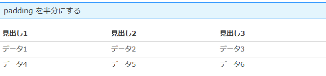
5. padding を半分にする
“table-condensed” クラスで、セルにかかっている padding 値が半分になる。
|
1 2 3 4 5 6 7 8 9 10 11 12 13 14 15 16 17 18 19 20 |
<table class="table table-condensed"> <thead> <tr> <th>見出し1</th> <th>見出し2</th> <th>見出し3</th> </thead> <tbody> <tr> <td>データ1</td> <td>データ2</td> <td>データ3</td> </tr> <tr> <td>データ4</td> <td>データ5</td> <td>データ6</td> </tr> </tbody> </table> |
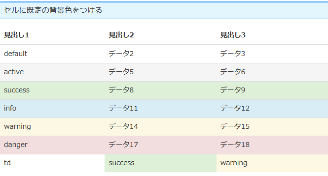
6. セルに既定の背景色をつける
セルに任意の色を付ける。
<tr> タグにつけると、その列全て、 <td> タグはそのセルだけとなる。
各クラス名は以下となる。
- .default
- なし
- .active
- マウスオーバーした時と同様の色
- .success
- うすい緑
- .info
- うすい青
- .warning
- うすい黄色
- .danger
- うすい赤
|
1 2 3 4 5 6 7 8 9 10 11 12 13 14 15 16 17 18 19 20 21 22 23 24 25 26 27 28 29 30 31 32 33 34 35 36 37 38 39 40 41 42 43 44 45 |
<table class="table"> <thead> <tr > <th>見出し1</th> <th>見出し2</th> <th>見出し3</th> </thead> <tbody> <tr class="default"> <td>default</td> <td>データ2</td> <td>データ3</td> </tr> <tr class="active"> <td>active</td> <td>データ5</td> <td>データ6</td> </tr> <tr class="success"> <td>success</td> <td>データ8</td> <td>データ9</td> </tr> <tr class="info"> <td>info</td> <td>データ11</td> <td>データ12</td> </tr> <tr class="warning"> <td>warning</td> <td>データ14</td> <td>データ15</td> </tr> <tr class="danger"> <td>danger</td> <td>データ17</td> <td>データ18</td> </tr> <tr> <td>td</td> <td class="success">success</td> <td class="warning">warning</td> </tr> </tbody> </table> |
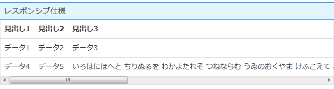
7. レスポンシブ仕様
ブラウザ横幅が 768px より小さくなった場合、”table-responsive” クラスの div 等で括ったテーブルにスクロールバーを表示させる。
|
1 2 3 4 5 6 7 8 9 10 11 12 13 14 15 16 17 18 19 20 21 22 |
<div class="table-responsive"> <table class="table"> <thead> <tr> <th>見出し1</th> <th>見出し2</th> <th>見出し3</th> </thead> <tbody> <tr> <td>データ1</td> <td>データ2</td> <td>データ3</td> </tr> <tr> <td>データ4</td> <td>データ5</td> <td>いろはにほへと ちりぬるを わかよたれそ つねならむ うゐのおくやま けふこえて あさきゆめみし ゑひもせす いろはにほへと ちりぬるを わかよたれそ つねならむ うゐのおくやま けふこえて あさきゆめみし ゑひもせす</td> </tr> </tbody> </table> </div> |
デモ
Bootstrapでテーブルを使うデモ はこちらから
![]()
![]()
Bootstrapでテーブルを使ってみるテスト
このページはブログ『Wataame Frog』の「Bootstrap使い方 テーブル編」という記事のサンプルです
lightning-bolt.xyz